Case Study / 05Matrimonial Website
Back to portfolio
Selected Project

Garhwal Matrimony

A trust-first matrimonial platform for the Garhwal community that makes it easier for families and members to search profiles, compare memberships, and start meaningful connections.

Industry
Matrimonial / Community Platform
Timeline
Multi-phase launch
Team
Design and front-end team
Stack
8 tools
Featured Surface
Responsive website experience
Garhwal Matrimony
Matrimonial WebsiteMulti-phase launch
Project Snapshot

A trust-first matrimonial platform for the Garhwal community that makes it easier for families and members to search profiles, compare memberships, and start meaningful connections.

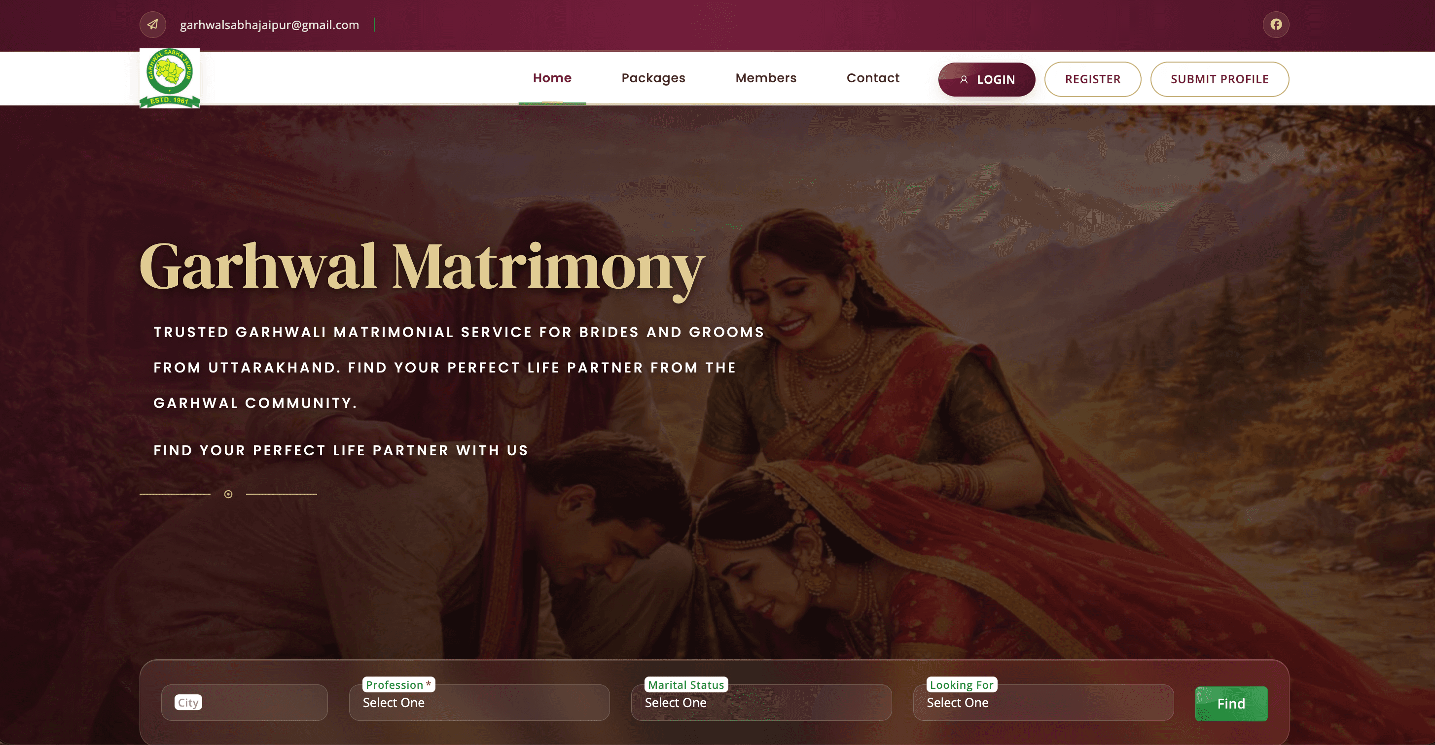
Garhwal Matrimony is a responsive matrimonial website created for the Garhwal community with a clear focus on trust, simplicity, and easy discovery. The experience combines a warm branded hero section, quick search filters for city, profession, marital status, and looking-for preference, straightforward login and registration paths, and visible submit-profile calls to action. The site also presents the organization's community story, explains the matchmaking flow, showcases membership plans, and answers common questions so new visitors can understand the service before joining. We positioned the platform as a modern digital matchmaking hub that supports family-led decision making while staying easy to use on desktop and mobile devices.

Primary Audience
Garhwal community families
Search Filters
City / Profession / Marital Status / Looking For
Membership Plans
Free + Paid Tiers
Delivery Narrative / 05

From challenge to outcome.

A concise breakdown of the business problem, the product approach, and the outcomes this build was designed to unlock.

Challenge

What needed to change

The platform needed to present a community-trusted matrimonial service in a way that felt modern, approachable, and easy to navigate for both families and individual members.

Solution

How we reshaped the experience

We shaped the website around trust signals, concise messaging, and fast profile discovery. The hero section introduces the brand clearly, the search strip lets users begin filtering immediately, the about section explains the platform's purpose, and the package cards make membership differences easy to understand. We also connected the experience with a simple how-it-works flow, FAQ support, and contact details to reduce hesitation before registration.

Results
01

Made partner search easier with visible filters and clear profile-entry paths.

02

Improved trust with strong community branding, membership transparency, and FAQ support.

03

Created a mobile-friendly experience that works well for first-time visitors and returning members.